
Overview
I decided to try to breathe new life into Baxter International Inc., a leading global healthcare company's outdated brand identity. Their existing logo appeared masculine, heavy, and failed to convey Baxter's innovative spirit or its mission to develop cutting-edge medical products that save lives.
Approach
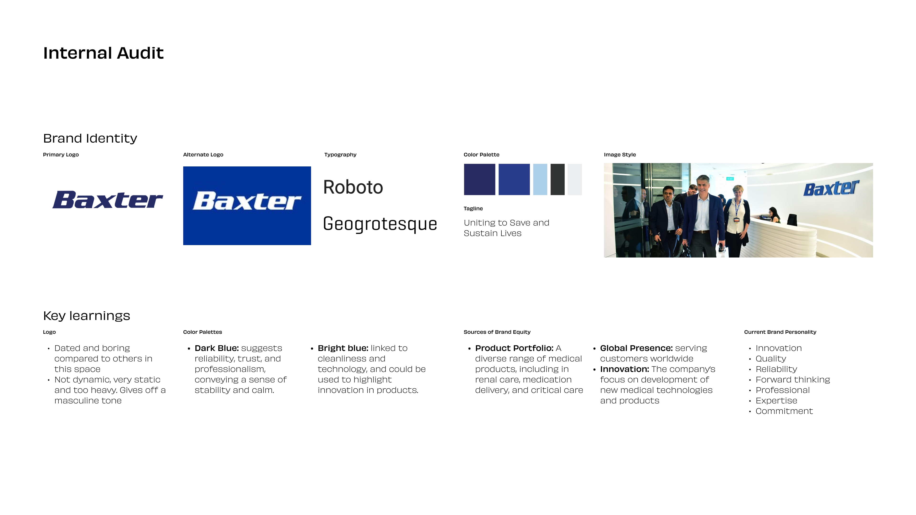
To reposition Baxter as a modern, trustworthy leader in the healthcare sphere, I initiated the rebranding process with extensive research into the company's values of innovation and quality with an internal audit. This guided my strategy for crafting a cohesive visual identity system that reimagines Baxter for the 21st century.
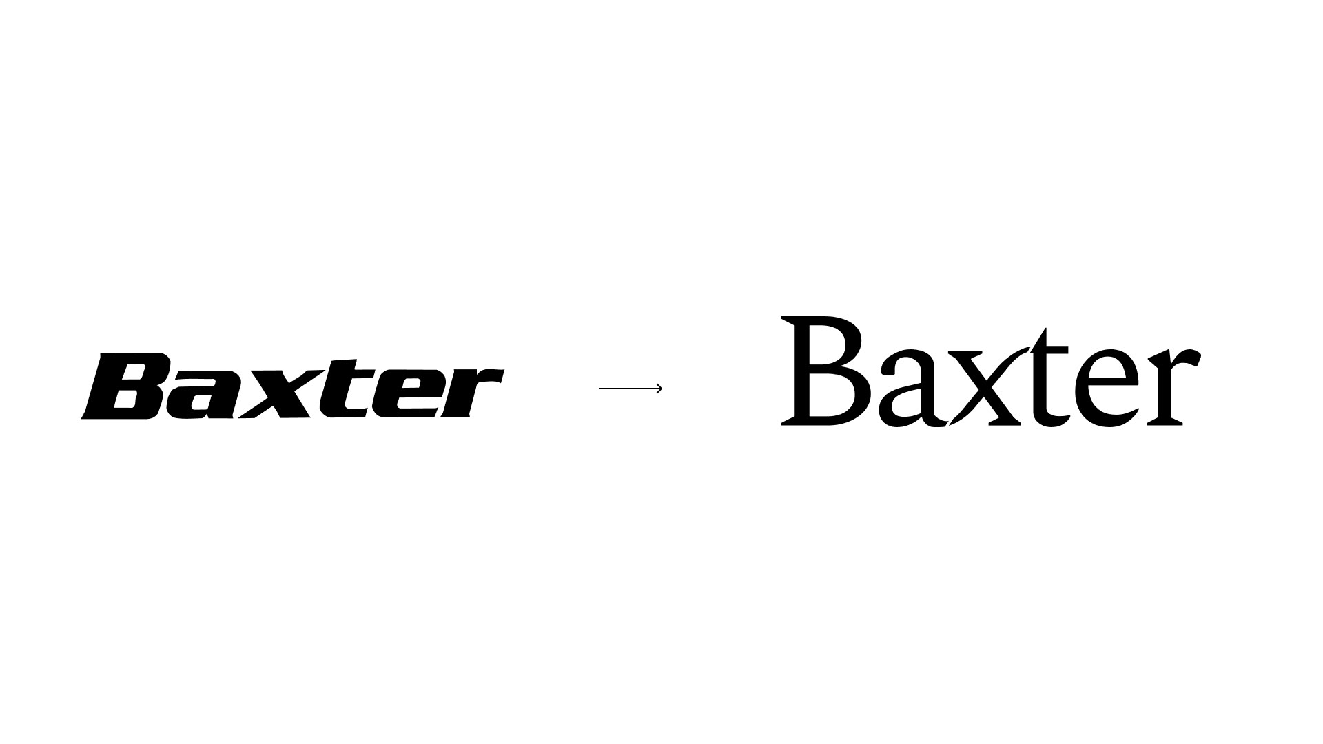
The centerpiece is a new logo mark that maintains equity in the bold name while introducing a fresh, curved aesthetic. The clean lines and open shapes evoke qualities like advancement, precision, and a human-centric approach. Bright yet premium colors reinforce a sense of expertise and optimism.
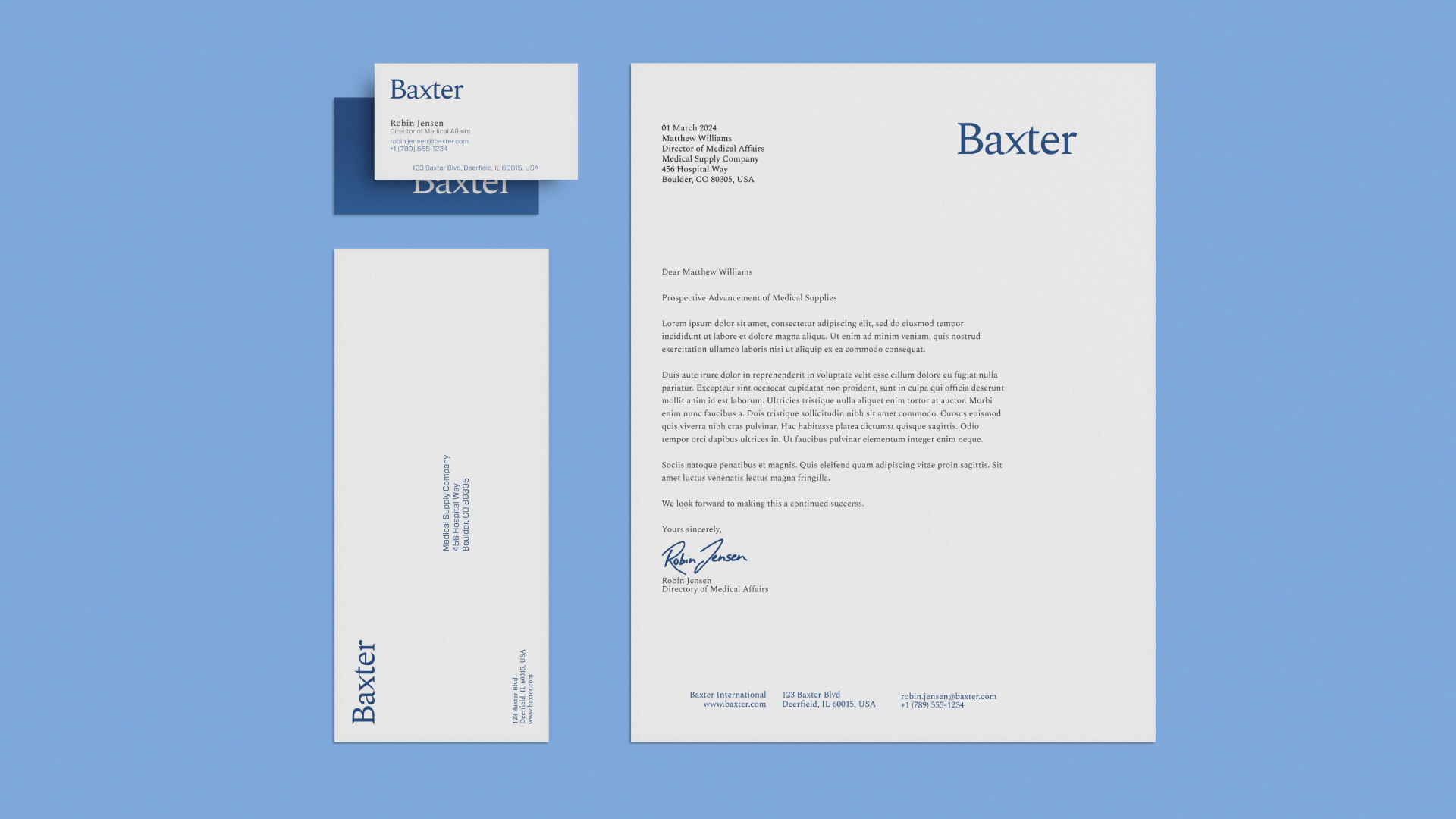
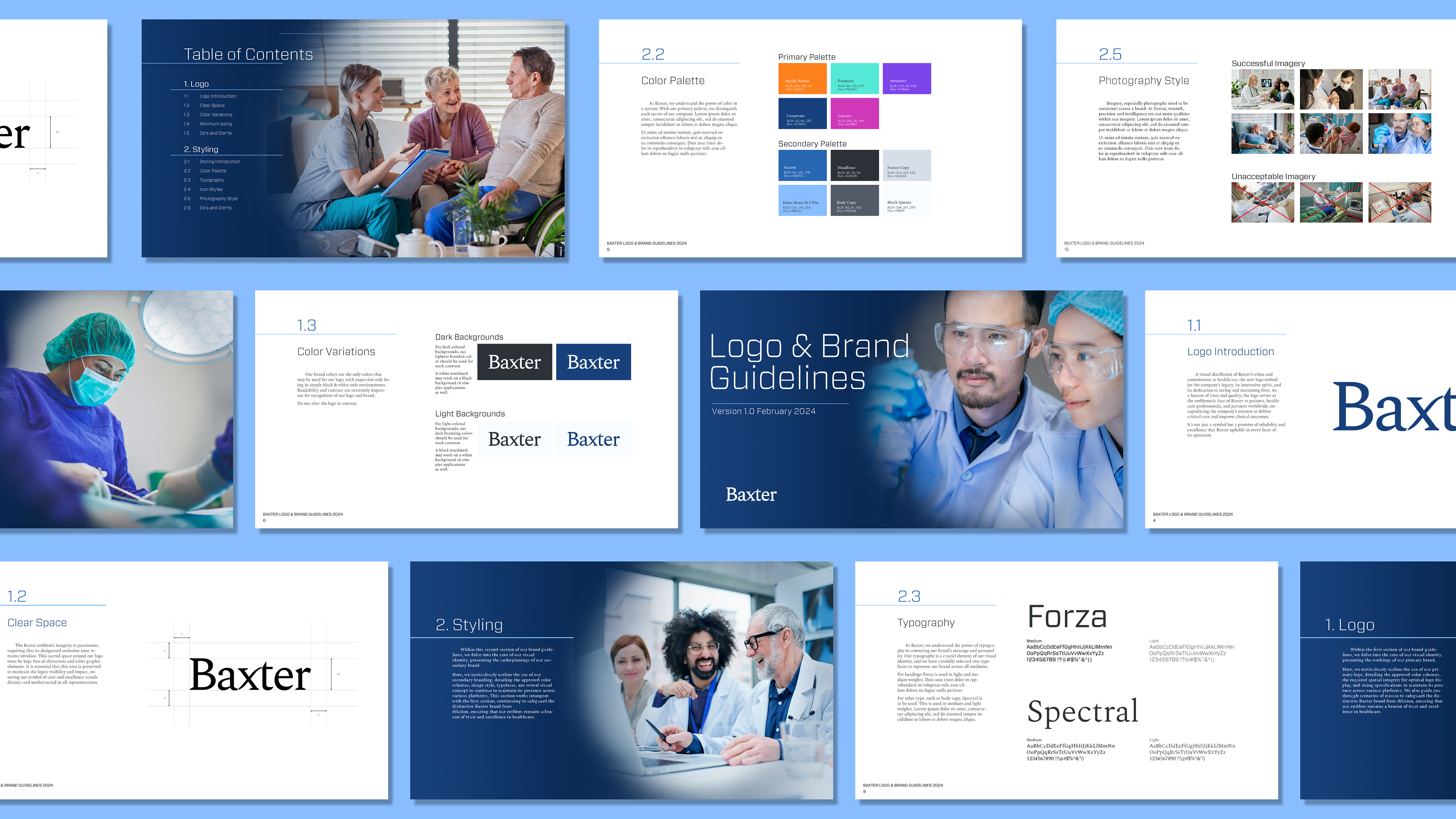
Extending across the brand guidelines, I established a comprehensive redesign encompassing stationery templates, typography paneling, iconography, and a distinct visual language. Each element works in unison to position Baxter as an authoritative, forward-thinking healthcare leader.
My rebranding work strategically revitalized Baxter's image while staying true to the company's core principles. The resulting identity system would equip Baxter with the modern, sophisticated presence required to facilitate growth and remain competitive in a rapidly evolving industry.