Overview
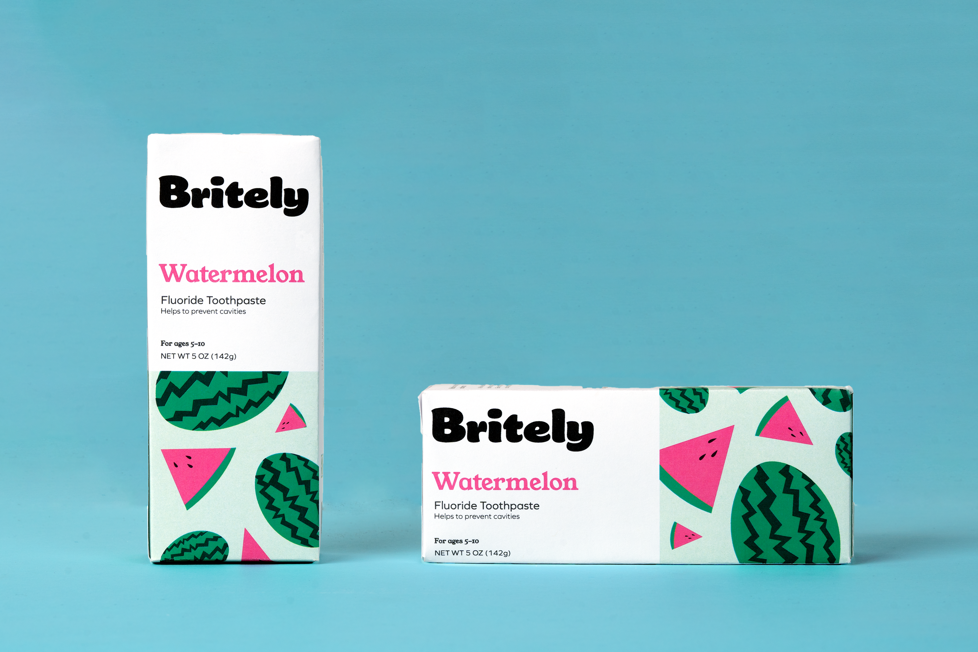
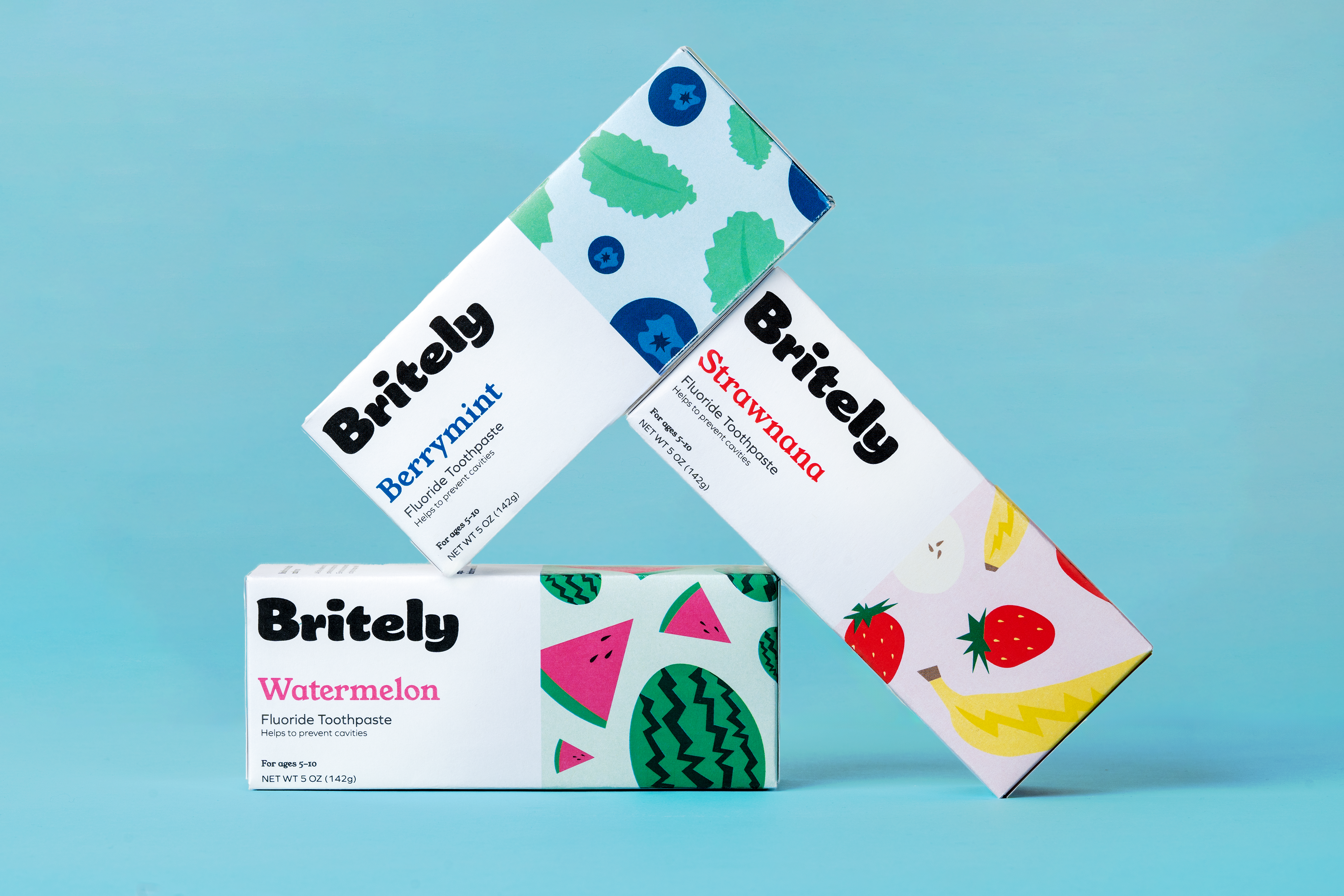
For the Britely kids toothpaste line, I needed to create eye-catching packaging designs and a brand logo that would appeal to children ages 5-10.
The challenge was to craft a fun, playful look that would engage young consumers while also providing clear product information for parents.
Approach
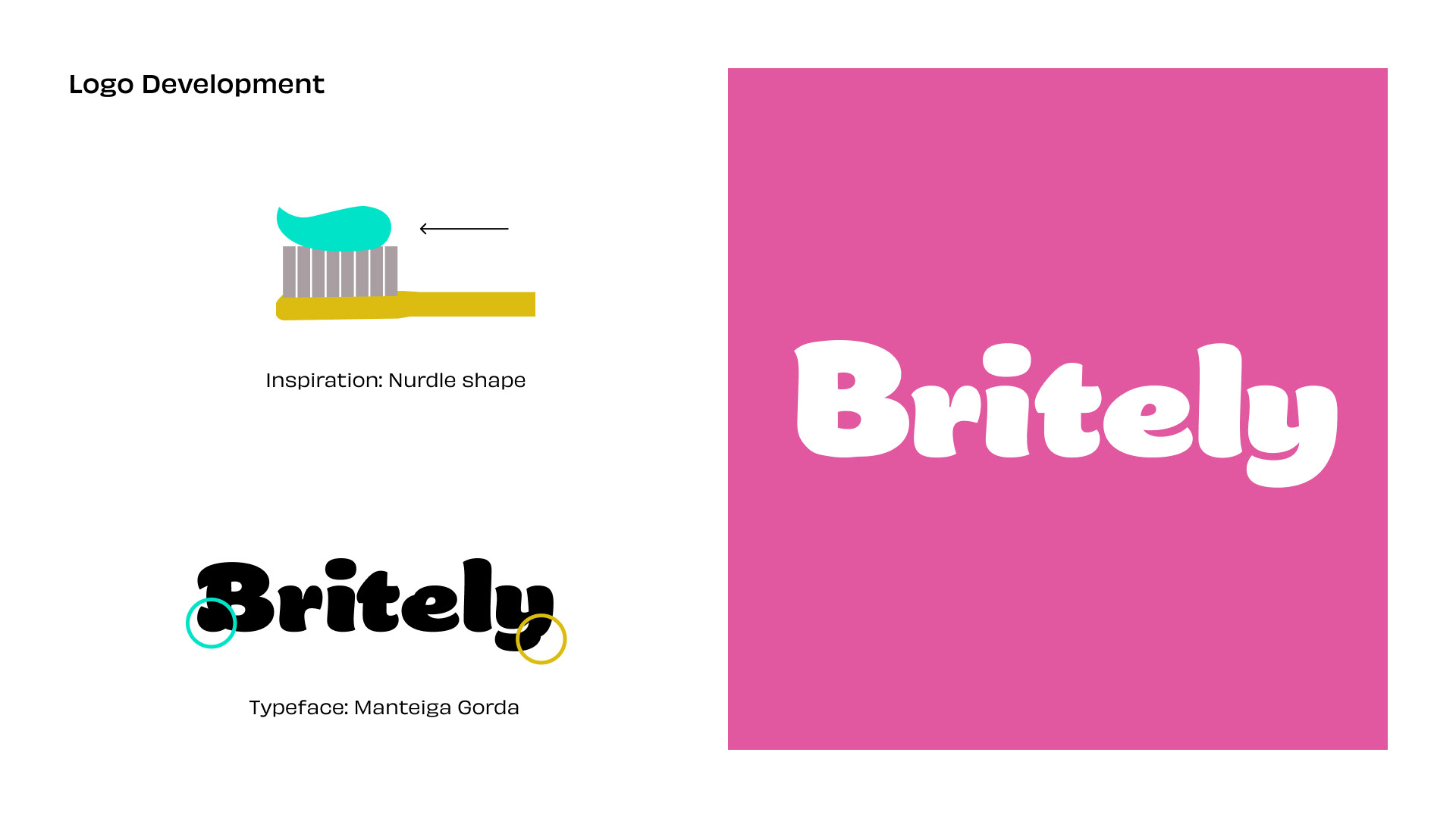
Toothpaste is not without the iconic, fun shape that comes to mind that seems as perfect as can be atop a toothbrush.
Fun fact: that shape is called a "nurdle," who knew?
The logo was then created out of a thick, almost brushlike typeface modified to mimic the perfectly clean squeezed nurdle look.
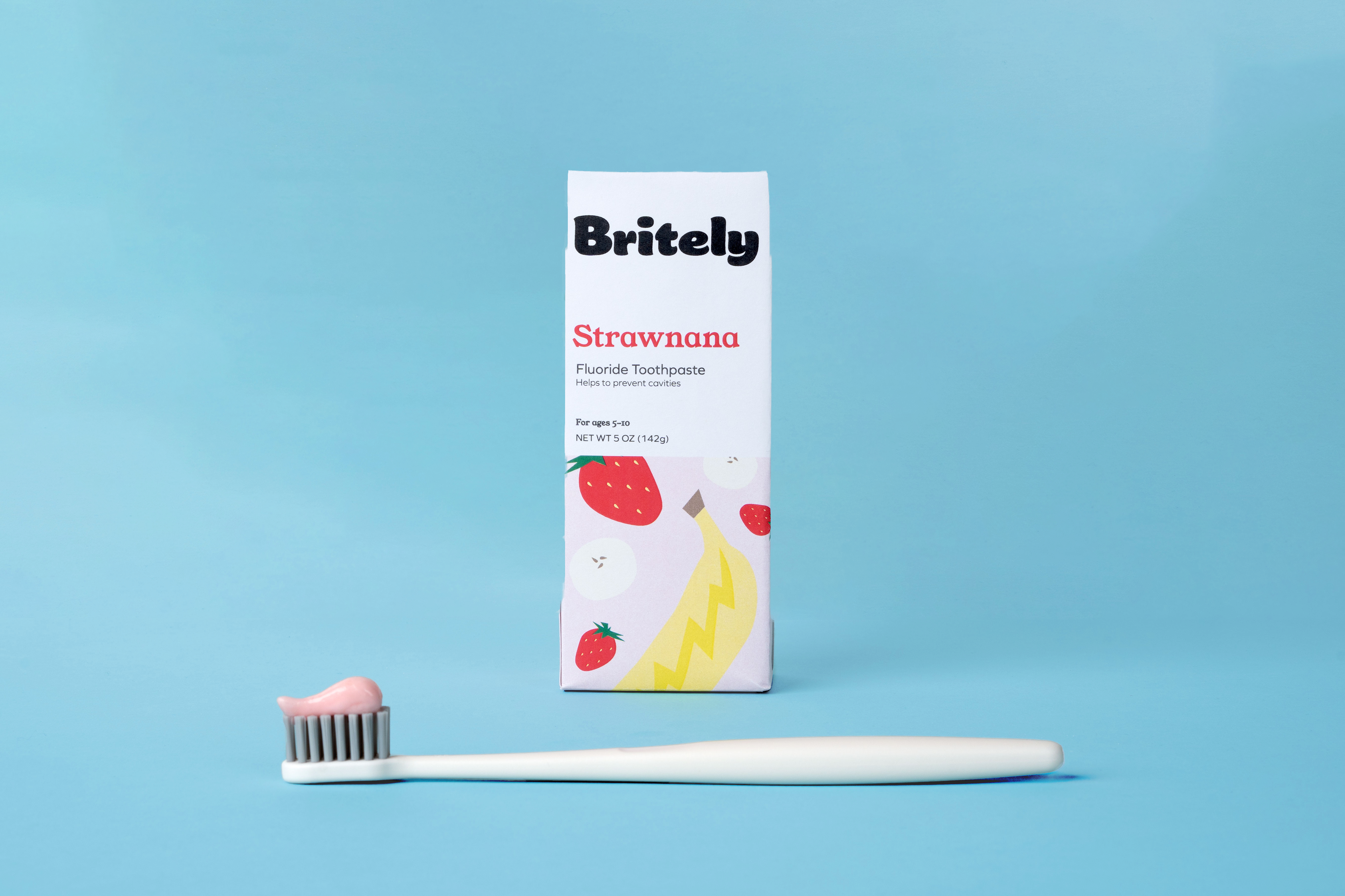
The solution featured three delightful fluoride toothpaste flavors: Strawnana, Berrymint, and Watermelon.
These flavors were made into patterns, featuring brightly illustrated fruit to grab kids' attention and still trustworthy for parents.
At the same time, the boxes' clean typography and simple icons spell out the toothpaste's vegan, organic, and teeth-strengthening fluoride formulation - key selling points for health-conscious parents.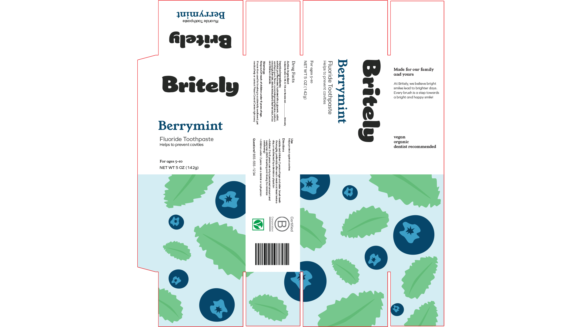
To showcase the finished product designs, I print, cut and assembled the boxes. After satisfaction, I then staged playful product packaging photographs that capture the line's playful yet trustworthy image.